Which Graph is Best?
Project #1581 on iSENSEProject.org
Lesson Objective: Students will show that they know what type of graph can be used to represent a certain set of data. Students will be given a consumer product to research and advertise. They will investigate five sets of data, some of which they will collect themselves through hands-on activities. Then they will organize the information into graphs they deem appropriate for the type of data using preset fields in ISENSE. These graphs should optimally represent different aspects of the product so that the consumer will be convinced to purchase the product. The students will be assessed on the graphs they chose to represent their data, and their justifications for their choices.
Content Standard/National Science Education Standard: Recognize the differences in representing categorical and numerical data.
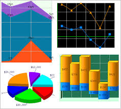
Compare different representations of the same data and evaluate how well each representation shows important aspects of the data.
Use measures of center and understand what each does not indicate about the data set.
Materials:
Stopwatch
Meter Stick and/or measuring tape
Scissors Centimeter rulers
4X6 Index Cards
Scotch/masking Tape
Plastic Straws (Not bendable)
Poster boards
Markers Crayons Colored pencils
Chrome books
Lesson:
Starter: Students will complete the worksheet using previously loaded data in ISense project 1581.
https://drive.google.com/file/d/0B4jTEtyaj7nZWmR5MkRVQzBwRFk/view?usp=sharing
Activity Stations: data will be inputted into ISENSE project 1696
http://isenseproject.org/projects/1696
Students should be grouped into groups of three. They should be assigned station numbers 1-5. These should be written on their fliers. No more than 20-25 minutes should be needed to complete data collection/analysis at each station.
Station Instructions: The Teacher Resource Sheets 1-4 are all for the stations. Feel free to cut out the boxed information on these and paste up at centers. Copies of the Student Resource Sheets should be made per group, NOT for each student.
Station 2: Place three cut strips of masking tape in a convenient place of the room, in the form of a ‘Y’. Student should have ample room to fly the flyer without disturbing other groups. They may even go put into the hall. Stations 1, 3, and can be done as seat work. If you decide to do station 1 in this way, you can make copies of Resource sheet 1 for each group. Station 4: Place two pieces of masking tape in the form of an ‘X’ on the floor. About 6 feet away from this place tape down the target resource sheet. There should be space for the student to fly the flyer to the target. You might want students do this in the hallway.
Note: Space should be made to store the fliers throughout the unit.
Lesson File:
https://docs.google.com/document/d/1FnBZAvj7yZ9VrDI8EM9Iy0SWVvq7yIzPN17ronMOI6w/edit?usp=sharing
Flyer Directions File:
https://docs.google.com/document/d/13oyj-jBMqN2hwOmQmC2iepm0gyGAPgl98J4gkdAJE7M/edit?usp=sharing
Assessment:
https://drive.google.com/file/d/0B4jTEtyaj7nZYk45bVhwcGM3UkE/view?usp=sharing
| Name | Units | Type of Data |
|---|---|---|
|
Timestamp
|
None
|
Timestamp
|
|
Test Tube Number
|
|
Text
|
|
PH level
|
None
|
Number
|
|
Grade in Science
|
None
|
Number
|
|
Month
|
|
Text
|
|
Food Type
|
|
Text
|
|
Percent of Food
|
%
|
Number
|
| Timestamp | Test Tube Number | PH level | Grade in Science | Month | Food Type | Percent of Food |