The iSENSE web development team is committed to delivering new features, fixing bugs, and tweaking the user interface to ensure you get the most out of iSENSE. This release touches on all those points.
Sorting data sets by contributor keys
Now, you can sort data sets by contributor keys. A key will appear next to all data sets contributed with a contributor key as shown below.

The letter on the key icon corresponds to a specific key, which you can view in the drop down menu. In the example below, all data sets contributed with the C Block Biology key are labeled A, and all data sets contributed with the D Block Biology key are labeled B.

Using the drop down menu, you select and visualize data sets contributed with specific contributor keys.
This feature is perfect if you want to analyze specific groups of data sets. For example, a teacher conducting an experiment with his or her C Block Biology and D Block Biology classes may want the option to analyze each class's data separately. If the teacher distributes two different contributor keys, one key for the B Block class and another key for C Block class, he or she will be able to visualize all data contributed by each class separately.
Visualizations are now configured with better defaults centering around the data point number field
The data point number field allows for more ways to visualize data sets that do not already contain number fields. The default y axis for timeline, bar, and histogram visualizations is now only the data point number when the project contains no other number fields. In addition, bar and histogram visualizations are enabled as long as there is a least 1 data point, and row count is now the only valid analysis type on a bar visualization when data point is the only number field.
Exporting data sets
You are can now export data sets as individual files or a single concatenated file. When you click the export button, you will be asked to select one of these two options.

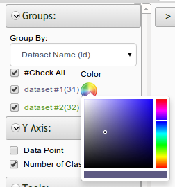
Introducing the color picker for visualizations
The color picker for visualizations now allows for the default color pallet to be overridden. You can select a customized color to represent that data by clicking the color wheel icon next to a data set on all visualizations.

And be sure to learn more about the iSENSE team on the Contact page.