Latest

2/4/23 | Version 9.9.0
This release provides the following new features:
- Visual change on the Table equality operator from “==” to “=”.
The following bugs were fixed:
- Strengthened site security to enforce user inputs match predefined allowed values.
- Updated Ruby libraries and dependencies.
- Fixed deprecation warning relating to password confirmation.
All News
4/29/16 | More User Information
The release of iSENSE 8.0 brings you a new user system. This new user system replaces our old user system that we build with a more powerful open source system that has allowed us to more easily integrate Google Account sign in into iSENSE along with a lot of new features behind the scenes.
Google Sign-in Support
If you have a Google Account you also have an iSENSE Account without having to do any extra work. If you already had an iSENSE account and you used your Gmail to create it, then signing in with Google will sign you into that existing account. This also means that you will not need to reset your password, you can just sign in with Google instead.
Password Reset
We reset all the passwords when we moved to our new user system so that there was no chance of any passwords being leaked during the move. For everyone who does not have an iSENSE account that was created using a gmail address, or if you did create it with gmail but want to also have the ability to sign in with an iSENSE password instead of using the sign in with Google feature, you will need to request a new password using the "forgot password" link on the sign in page. You will recieve an email with a link that will allow you to create a new password.
If you run into an issue setting up a new password please email Professor Fred Martin at [email protected]. Please add "iSENSE Password Issue" to the subject line of the email.
2/19/16 | Release v7.7.0
This release has several features along with various bug fixes.
New Group By Option
This is feature for every visualization and allows users to group by contributor.
There is also a new group by option for pie charts that groups by number fields.
Manual Axis Bounds For Scatter
This feature allows user to manually set bounds by typing into text boxes.
Data set name defaults to username and time stamp
When you make a project the dataset name will default to your username and a timestamp.
This ensures that each dataset name is unique. These default names can be changed if the use wishes.
12/4/15 | Release v7.6.0
This release has several features along with various bug fixes.
Mobile
Visualizations are now fully supported on mobile devices. That means that you have full access to all the visualization tools that you would on your PC.
Project and Visualization Index pages
Project and Visualization index pages have had a makeover. In the last release we introduced Material Design, a UI theme designed by Google. We have extended that theme to the project and visualization cards.
Error Bars are back
The introduction of data filtering had the side effect of breaking error bars on bar chart visualizations. That issue has been addressed.
11/13/15 | Release v7.4.2
There were several bug fixes as well as two major features:
Material Design
Material design was integrated into the site. This can be seen several places including the new buttons, check boxes and radio buttons.
Homepage Re-Design
The homepage redesign changed the look and feel of several aspects of the homepage. These changes can really be seen on the mobile site. The mobile site is now much more user friendly and iSENSE's features can be more easily accessed from the mobile site.
10/16/15 | iSENSE v7.4.0 Release
This week we had two major features that were released into the site.
Data Filtering
This allows users to select a range of values within a data set and save this range so that it can be used across visualizations. For example you can zoom in on a scatter plot and then "Set Current Filters" which makes the data that appeared on the zoomed chart appear on all the other visualizations.
Reordering Fields
Now when editing fields you can drag to reorder them. This new order will appear when looking at the fields in the visualizations.
6/24/15 | iSENSE v7.2 Release
With the second release of the summer, the iSENSE team brings new features, bug fixes, and UI tweaks.
Group Photos by Data Set
While viewing multiple data sets you can now group the photos by data set. This makes the photo visualization much more powerful as you can now group and filter photos from different data sets.
Error Bars on Bar Chart
Now you can view error bars on bar chart. An error bar shows you one standard deviation. This allows you to quickly see how much your data varies from the average.
Timestamps are now in your timezone.
Previously all timestamps were in GMT timezone. Now iSENSE converts all timestamps to your local timezone.
5/29/15 | iSENSE v7.1 Release
With the first release of the summer, the iSENSE team brings new features, bug fixes, and UI tweaks.
Camera Icon on Map Vis
Data sets containing images now have camera icons on Map Visualizations instead of circles! This complements a previous feature that allows you to view any images a data set has by clicking on a data point on the map. Now when viewing multiple data sets at once it is easy to pick out which ones have images.
Search Data Sets on Project Page
Now you can search for data sets on a project page. This allows you to easily find the data sets that you want!
Zip File Support
You can now upload zip files that contain multiple data sets. This is a useful feature for users who have many files that they want to upload to a project. No more uploading them one at a time!
5/1/15 | iSENSE v7.0 Release
The iSENSE team has been working hard to bring you iSENSE v7.0 before our semester comes to a close.
The iSENSE team has been working hard to bring you iSENSE v7.0 before our semester comes to a close. This release offers ground-breaking changes to make collecting, visualizing, and sharing data more intuitive for everyone. Read on to learn more about this release.
Beautiful New Visualization Tools
We take pride in building visualizations that assist you in getting the most from data analysis, and v7.0 offers completely restyled visualization tools to do just that. Visualizing data on iSENSE has never been so easy to do. Visualization tools are now located on the left part of the screen. All the previous visualization configuration options still exist, but they have been restyled (and even improved in some cases).
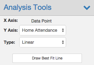
Advanced Regressions
We have expanded your mathematical analysis toolkit on iSENSE by adding symbolic regressions to Timeline and Scatter visualizations. Under Analysis Tools, simply select "Automatic" as Type, click "Draw Best Fit Line," and watch as iSENSE automagically generates a regression function that best fits your data. Additionally, regression lines now appropriately adjust as you zoom in and out on visualizations.
Edit Fields Page Makeover
Setting up projects is an important part of using iSENSE, and for that reason, we've redone our edit fields page to make your experience seamless. Simply add and delete number, text, timestamp, and location fields as you please, and then save. This new page makes it easy to setup and edit your project's fields.
Stay tuned as the iSENSE team continues to work hard to bring you new features, UI fixes, and more throughout the summer!
4/10/15 | iSENSE v6.7 Release
iSENSE v6.7 is out, and the website has never looked so beautiful.
A Brand New Footer
The footer has been re-organized and re-styled to better guide you in navigating iSENSE.
Projects Page Facelift
I spy with my eye... my project! Finding your project on the projects page just got easier. Projects without default images are now displayed with their title as an image to help you quickly find it on the projects page.
Looking ahead...
Stay tuned for more UI updates across the website, new visualization tools, improved regressions, grouping by contributor keys on visualizations, and a more user friendly fields page.
3/27/15 | iSENSE v6.6 Release
iSENSE v6.6 offers bug fixes, UI tweaks, and a new visualization feature -- viewing images on the map visualization!
Now, if you upload pictures to a data set, those pictures will appear on the map visualization. Simply click the markers on the map to view the picture associated with that data set. Viewing pictures directly on the map will help you to better analyze your data.
Another visualization update is the addition of a "Get Latest" button to reload a project with all the latest data. This should be a convenient way of refreshing when data sets are continuously being added.
For developers, we've updated the API documentation page. It now includes code samples and detailed notes for each request.
Stay tuned for new features in the upcoming weeks...